
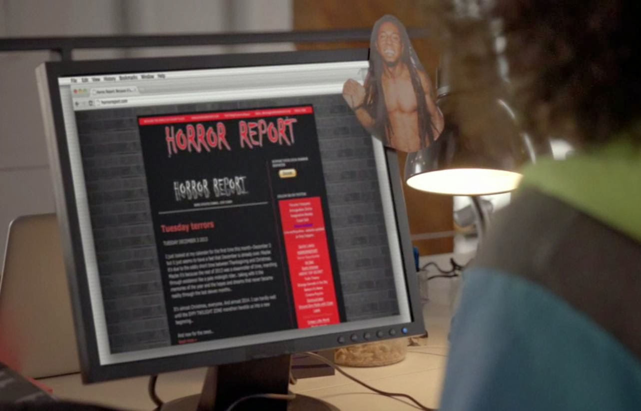
New visitors may not care.. old timers may see a big difference. The HORROR REPORT has changed its design for the second time in history..
The last time the HORROR REPORT changed, reader reaction was clear: It was hated.
The HORROR REPORT gained its fame in 1999 on an old Geocities site. It became a domain name with a dash in 2001.. And since then, it primarily maintained the same exact black and red look with few exceptions ..
In 2013, a new design was implemented and most users who emailed or contacted the HORROR REPORT dislike the new design..
This go around, we hope that it’s more user friendly, and more interactive..
Please share your thoughts with us.. does the new look work? Does it fit the mood, the intent, and then purpose of the HORROR REPORT?
Collectively conscious me.
Whatever way you choose to connect..
We hopefully have hit the nail on a new design.
If not, we intend on changing it back if enough oppose the new look.

Comments
6 responses to “New Look, Same News”
uglyChange it back
ditch it.. hate it.I can't find anything
NO!!!Where did the black go!?
Where it should have. Gone.I like the new look. Bravo on a modern design
Thanks for the feedback so far.I'm running 4-1 against the new design.. Not good ..
THANK YOU for the nice comment.